8 May 2009
active forms
You cast a color on each action that appears in the book. What comprises an action in the book. What could be such action that you respond to and how can it be (pre-)conceived as part of a book (structure)? Or does the action imply the decision to make it part of a book and this is what you act on?
7 May 2009
Distraction

To draw attention to the approach to the from, the approach becomes the form and the perceivable form itself, this is why I dispute collection, this is not an approach only an impulse or mechanisation of too much time on ones hands. What could be beyond an impulse into an approach that is the form?
At the point when the imperfect mirror acts (coated alumninum in midnight blue) it acts by simoultaneously absorbing and reflecting, one folds and unfolds, draws a line out and up and not at all. Ambivilent?
I too am supposedly making a book, where colour is used to cast light on the each action that occurs within the book, the books appears accumulitively. An index, we drop it in.
Ambivilence?
Letter
The idea for a publication rose during a studio visit with Joelle Tuerlinckx last year, she saw there was enough material that would be suitable for such a format. She had brought some of her own books for her presentation that day, I found them very inspiring but they have also set an impossible standard. I hear all the time that my work reminds people of her work, and I don't really know what is the reason for this projection, e.g. I unfortunately do not have this collecting mania and therefore cannot make the work of the (personal) archive the content of a book, even if I would have liked to. In her books (or the one I looked at specifically titled b.o.o.k.) structure personal anecdotes and descriptions of exhibitions by a specific attribute of the work, in this case color. The nominalism applied creates both a fictional and personal thread that runs through the work. Through assignation the book (the reproduction) is taken beyond the status of a documentation/recording of an exhibition. The plain naming of things, in a stage of reduction, denies the promotion of a specific experience (think e.g. of a linear relation between pre- and post-production or any durational aspect for that matter) by leveling (neutralising) the value of the different works, thus creating a potential for endless proliferation/multiplication. This somehow grasps a reality that I find very attractive. (Is this sense of reality rendered through a structure that is at times applied arbitrarily and sometimes justifiably?- creating a closed system that opens up for an abstract elsewhere)
In Role of a Lifetime (vanAbbemuseum until June), Deimantas Narkevičius combines drawings of a landscape where a lot of post-war socialist sculpture in Lithuania reside, films by an amateur filmmaker depicting Brighton and an interview with Peter Watkins. Especially interesting here is the moment where Watkins describes how he became interested in a series of photographs published in Paris Match and studied where the people were, what they were looking at, to extract that special feel that would allow him to construct a make-believe reality, which this series expressed for him. Further how this perception of what is real is completely subjective, he continuous that the fact that his work has always been marginalised must have effected his view; his political- and social position.
Peter Piller collects images that are familiar to everyone. He finds them in the filing cabinets of regional newspapers or in the archives of a company that sells aerial photos of houses. Freed of their original purpose they initially seem to be devoid of meaning. When the artist rearranges them and classifies them in series they at first reveal the clichés of commercial photography, but then also bring new meanings and unusual relationships to light. What appeared to be a detail, somewhere on the edge of a photo, could be the start of a narrative.
The reason that I'd like to start working on a book has to do with a slight feeling of discomfort when it comes to the exhibitions I've done so far. Even though they are very real to me, they appear (real) and disappear quite arbitrarily. The duration of the different shows, varying between one or two months, stretches the moment of presentation to an unspecified length and leaves me with a surreal feeling.
I would be most interested in employing/utilising the publication as another moment of selection (just like the exhibition), whereby this selection/construction process is imbedded in a larger structure; that of everyday life. So rather than extracting the particular from the mundane as Peter Piller does, I'd like to strengthen the ties between the personal work and the world/mundane/reality. (multiplicity)
6 May 2009


12 February 2009
Transformation versus Juxtaposition, Identification versus Standardization


This is an impossible attempt to set up a relation between the archive, working with the materials (process) and its representation. Integrating the different time levels, but at the same time undermining the idea of retrospection from the standpoint of the here and now. On the one hand and not visible in the images attached yet:
History / process / standstill (fix) / frame.
On the other hand and here I made an attempt to visualize it with the materials at hand:
Present / afterimage (color filter) / temporal / standardization (sequence, A4) / transparent
The main motivation behind making this disfunctional structure is to allow myself to make a selection of the vast array of accumulated images connected to this project, but also to create a framework which makes it possible to discuss and negotiate these decisions, by this I mean the structure as well as the selection process.
9 February 2009


neutral |ˈn(y)oōtrəl|
adjective
1 not helping or supporting either of two opposing sides, esp. countries at war; impartial : during the Second World War Portugal was neutral.
2 having no strongly marked or positive characteristics or features : the tone was neutral, devoid of sentiment | a fairly neutral background will make any small splash of color stand out.
A neutral background pale, light; beige, cream, taupe, oatmeal, ecru, buff, fawn, gray; colorless, uncolored, achromatic; indeterminate, insipid, nondescript, dull, drab. antonym bright, colorful.
 Neutral: splash of grey paint, desk lamp yellow light, beige office table.
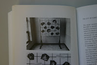
 Part of the work The arrangements of sorts:
implying different strategies for the organisation of information. (see floating plan below)
Some time ago I made a copy of an essay from a book available in JVE library. The essay Documents and Engagement (?) is written by Dirk Lauwaerts and I think the book is called Attitudes and Positions in Photography. It explains my intuitive attraction to bureacratic documents as a self relativating counter force when I commenced to work with the social support structure.
Floating Oblique Plan
 A layout of the space in Artis, a similar type of drawing could be used as description for the works during the exhibition.
The rectangular shapes in the space are angled panels from color coated aluminum or opaque perspex, or some other glossy, sharp edged material. The idea is that they are supported by construction elements in the building, such as corners between floor and wall, intersections between two walls or between a column and the floor. The panels reflect or double this intersection that also keeps it in an angled position. The design is a bit derived from the display elements that you designed for the exhibition in Haus der Kulturen der Welt. What I liked from the photos documenting that exhibition which are posted on this blog; are the narrow, useless spaces generated at the back side of these displays. The residual spaces work really well in contrast with the open display surfaces. I would alter the design a bit in the context of Artis, besides making literaly use of the building as a support structure. By choosing a more 'finnished' material like aluminium the panels slice through and end abruptly in the space. Which could be a quality that can perform in relation to its flexible, temporal and repetitive qualities. I am really curious how the images on display are correlating with the displays themselves. I can't really tell from the documentation I've seen so far. In this case -and I still didn't select any particular images or objects for display, but perhaps designing a display in the first place would help- I wouldn't limit myself to the surface of the panels as a display area, anywhere near would be good and sometimes even better. Then I think they can perform both the function of presentation and representation simultaneously. A little bit like some of the photos I've posted before, e.g. with the angled grey board and the print of the shelves put up on the wall of my studio. A support that allows the conditions for multiplicity to occur. Maybe this kind of display is the next step after disorientation set in motion by the angled plane towards disintegration. Below a quote from Falke, more of this text: http://www.smba.nl/en/exhibitions/object-the-undeniable-success-o/
 Sketch for display works VPRO and Videoclass.
Loosely based on Bruce Nauman's Corridor or Tunnel works, I'm not sure which one I've seen in the Stedelijk many years ago. While I was looking for a title and description of his video installation I came accross a text describing some kind 'withdrawel from the subject position' phase, I've gone through that phase as well (photos hallway JVE). Working with these corridor spaces but also triangular spaces and bright light, he was very much interested in conditions that create a sense of physical disorientation.
adjective
1 not helping or supporting either of two opposing sides, esp. countries at war; impartial : during the Second World War Portugal was neutral.
2 having no strongly marked or positive characteristics or features : the tone was neutral, devoid of sentiment | a fairly neutral background will make any small splash of color stand out.
A neutral background pale, light; beige, cream, taupe, oatmeal, ecru, buff, fawn, gray; colorless, uncolored, achromatic; indeterminate, insipid, nondescript, dull, drab. antonym bright, colorful.
 Neutral: splash of grey paint, desk lamp yellow light, beige office table.
 Part of the work The arrangements of sorts:
implying different strategies for the organisation of information. (see floating plan below)
Some time ago I made a copy of an essay from a book available in JVE library. The essay Documents and Engagement (?) is written by Dirk Lauwaerts and I think the book is called Attitudes and Positions in Photography. It explains my intuitive attraction to bureacratic documents as a self relativating counter force when I commenced to work with the social support structure.
Floating Oblique Plan
 A layout of the space in Artis, a similar type of drawing could be used as description for the works during the exhibition.
The rectangular shapes in the space are angled panels from color coated aluminum or opaque perspex, or some other glossy, sharp edged material. The idea is that they are supported by construction elements in the building, such as corners between floor and wall, intersections between two walls or between a column and the floor. The panels reflect or double this intersection that also keeps it in an angled position. The design is a bit derived from the display elements that you designed for the exhibition in Haus der Kulturen der Welt. What I liked from the photos documenting that exhibition which are posted on this blog; are the narrow, useless spaces generated at the back side of these displays. The residual spaces work really well in contrast with the open display surfaces. I would alter the design a bit in the context of Artis, besides making literaly use of the building as a support structure. By choosing a more 'finnished' material like aluminium the panels slice through and end abruptly in the space. Which could be a quality that can perform in relation to its flexible, temporal and repetitive qualities. I am really curious how the images on display are correlating with the displays themselves. I can't really tell from the documentation I've seen so far. In this case -and I still didn't select any particular images or objects for display, but perhaps designing a display in the first place would help- I wouldn't limit myself to the surface of the panels as a display area, anywhere near would be good and sometimes even better. Then I think they can perform both the function of presentation and representation simultaneously. A little bit like some of the photos I've posted before, e.g. with the angled grey board and the print of the shelves put up on the wall of my studio. A support that allows the conditions for multiplicity to occur. Maybe this kind of display is the next step after disorientation set in motion by the angled plane towards disintegration. Below a quote from Falke, more of this text: http://www.smba.nl/en/exhibitions/object-the-undeniable-success-o/
It is the setting of the supporting structure, which first enables the object
to go from an invisible to a visible realm; which subsequently provides the
conditions for its reception as a consistent and solid unit, and which will finally
instigate the disintegration of the object.
The resulting support does not only subscribe to the formal aspects of the
object, but also addresses its qualities and conditions of expression as well
as the potential of its meaning.
She continues...
The structure to which the spectator becomes receptive, is not bound to any
field of relationships, but traverses all different domains.
His relationship towards the object makes place for a multitude of different
relationships towards its attributes, qualities, features, disparate elements –
and the structures that support them.
field of relationships, but traverses all different domains.
His relationship towards the object makes place for a multitude of different
relationships towards its attributes, qualities, features, disparate elements –
and the structures that support them.
 Sketch for display works VPRO and Videoclass.
Loosely based on Bruce Nauman's Corridor or Tunnel works, I'm not sure which one I've seen in the Stedelijk many years ago. While I was looking for a title and description of his video installation I came accross a text describing some kind 'withdrawel from the subject position' phase, I've gone through that phase as well (photos hallway JVE). Working with these corridor spaces but also triangular spaces and bright light, he was very much interested in conditions that create a sense of physical disorientation.
16 January 2009
Three options, which can coexist -because structures are for sissy's- to work with, speak to, have an encounter with the material of the archive (or other mild forms of activating the archive material that is not aiming for a complete didactical/informational overview).
3) Repetition; repeating or mimicking opposing points, spatial traversals, contingencies that are already present in the archive in my day to day environment. Includes: studio, storage space. (kind of complex)
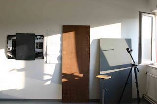
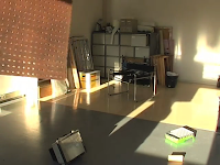
(from left to right)
Digital print job-square Enschede 2o07,
A2 glossy paper grey,
A1 copy plan Social Service Enschede 1969,
perforated board,
lab stool,
MDF board grey,
tripod,
window half-opened.

View from my studio window, Hengelo, 2009.
1) The porosity of time.
Following the grid through different topologies/ time: Exhibition '1940-1945' in the basement of the Social Service, Nijmegen, 1969 - Documentation of Steven Willats displays (He still makes use of the same display strategies for his schemes and grids as he did in the 60's.) - The job-square in Enschede where the grid is applied on walls with a decorative function. - The use of the grid in my studio and Artis.


I have thousand of these images, but haven't found a way to work with Picasa albums yet, I would like to put some restriction on their public accessibility.
2) Color coding, possibly material listing (reflection, absorption) and sort of lighting (daylight, artificial), because these conditions affect the colors naturally:


Perhaps this is a good handhold for you (Andreas) to work with?
3) Repetition; repeating or mimicking opposing points, spatial traversals, contingencies that are already present in the archive in my day to day environment. Includes: studio, storage space. (kind of complex)

(from left to right)
Digital print job-square Enschede 2o07,
A2 glossy paper grey,
A1 copy plan Social Service Enschede 1969,
perforated board,
lab stool,
MDF board grey,
tripod,
window half-opened.

View from my studio window, Hengelo, 2009.
1) The porosity of time.
Following the grid through different topologies/ time: Exhibition '1940-1945' in the basement of the Social Service, Nijmegen, 1969 - Documentation of Steven Willats displays (He still makes use of the same display strategies for his schemes and grids as he did in the 60's.) - The job-square in Enschede where the grid is applied on walls with a decorative function. - The use of the grid in my studio and Artis.


I have thousand of these images, but haven't found a way to work with Picasa albums yet, I would like to put some restriction on their public accessibility.
2) Color coding, possibly material listing (reflection, absorption) and sort of lighting (daylight, artificial), because these conditions affect the colors naturally:
- Social Service 1986 (Leiden): television tube colors; blue, green, red.
- The archive dossiers (Amsterdam); pale- brown, green, pink.
- Depository (Nijmegen): apple green, artificial light: fluorescent daylight and warmlight.
- Job-square (Enschede): orange, others use bright colors like; apple green, magenta, blue
- Studio (Hengelo/Maastricht): grey, white, beige (considered neutral colors)


Perhaps this is a good handhold for you (Andreas) to work with?
13 January 2009
Sliding from improbability into reality


 Oblique Violence
The images you'd posted some while ago titled: Destabilizers, made me think of a discussion that came up during the diagram cluster about the distinction between games and experiments or play and simulation. Clearly the Pendular Destabilizer tends to be more of an experiment or a simulative environment, but for example Theo's wooden block has a playful element to it. With these destabilizers in mind I'm going to think and write towards the destabilizing moment in the works and photographs that accompany this text. The distortion that took place in the reproduction of an archive image is perspectively 'corrected' in the installation with a floating cardboard which serves as a projection surface and is suspended in the same oblique angle as the angle of the camera set up during the moment of reproduction. In this process a trapezium of residual light, that is nevertheless part of the reproduction is cast on the wall/door/door frame/window. This is quite a technical and formal shift, which analyses the moment of reproduction; camera (production) and projector (presentation) can in fact be swapped and with it the original event leaks into the documentation, the original location into a new location. The installment with the floating cardboard suspended with fish wire is quite a different language that speaks of the stance towards the subject (matter). The gesture perhaps opposes the technocratic, 'impersonal' procedure of distortion and correction. It is a nostalgic act, that is elaborated on by the Malevich like shaped leaking projection light on the back wall. Talking about Nostalgia, romanticism and desire are not far off.

Does describing the work get me anywhere?
PARTICIPATION-INTERACTION-ACTIVATION
Actually the destabilizer appears more in this context: openness/passive - aggression/ active. In the dialogue with Ruth before she coined the term passive design in relation to flexible


Shades, reflections cast on anything without making a distinction between the different dimensions, humans or objects. These shades, reflections also disturbs the density of joints or intersections that often define the transition from one dimension to another, or one space to another. When these densities of intersection are more diffusely spread in space, the space transforms; inverted, turned upside down, at odds with gravity.
27 November 2008
Video class


In this introduction video of a documentary from '86, titled: "Local Social Service; Right or Rule, part 1,
a woman's voice explains the content of this documentary that we are about to see. As background music one can hear a synthesizer play a riddle with a repetitive theme.
I imagine this video screened on a box monitor placed in the vicinity of a wall, which reflects the characteristic bright colors inherent to the outdated ('timed') technology of the television tube; yellow, green, green, blue and red.
This setup naturally in relation to the not yet finished video-class, where the gestures are floating or activated in a state of suspension.
Subscribe to:
Posts (Atom)